The Two Brandon Targets, Part 2 - Target #2235
Target #2235
10150 Bloomingdale Ave, Riverview, FL.
Opened in 2006 with Target's P04 interior, and was remodeled in November 2019 to P17.
The front side of this Super Target location, with the logo nearly being placed in the center of the frame. Pre-remodel pictures are from mid 2017 to early 2019.
This is the left side entrance, which is used for guest services and all other departments.
This Target store used to have a garden center until 2010.
Enter through these doors for some before pictures of Target store 2235!
Version 2 of store 2235's customer service counter, updated in 2017. The 2019 remodel moved order pickup into a separate section.
Target's Prototype 2004 aisle signage, which looks similar to the 2001 version, only that all of the colors are red.
Looking at the D section of the store. Some of the aisle markers were replaced with Microsoft Word printed letters.
Overhead signs for the men's and women's fitting rooms, before being relocated.
Notice the gray paint? This is due to an Innovation Remodel that occurred in 2017.
Looking inside at the former women's fitting room. Lockers are to your left, and straight ahead is another locker that is expanded for the disabled.
One of the price scanners in this store, before being updated in 2019.
On the side of the price scanners, is a store map.
Looking at the main center aisle, split between menswear and the baby section.
Target P09 aisle signage in the movies department!
Section W is the grocery department and frozen foods. This is looking from aisle W26, or aisle 13.
The last aisle, aisle 15 or W29/W30 consists of dairy products. Dairy expands into the rear of aisle 14 or W27/W28.
The rear side of frozen foods and groceries. Notice that the aisle signs in the rear turn 90 degrees?
Aisle 14, or aisles W27/W28 is home to frozen foods.
This aisle (7, or W13/W14) is the candy section. Some P04 neon can be seen in the rear of this aisle.
This Target store opened with their pharmacy in 2006, before becoming a CVS Pharmacy in 2015.
2004-2009 aisle signs for Target's grocery department.
This is one big deli department! Located after the store's Starbucks.
The front end checkouts as seen in 2017. This store used to have about 24 checkout lanes before the addition of extra self checkouts.
A Target branded in-store cafe, which uses the bullseye as a plate, followed by a fork and a spoon. To the right is an express Pizza Hut.
Let’s jump over to November 2019 for the finished remodel project!
In June 2019, this Target store started a 4-month remodel project that moved almost everything in the store. The remodel was finished in mid-October, but I did not get any post remodel photos until early November.
The updated front of the store. The Super Target logo is gone, being replaced by a lowercase Target logo, which also resulted in the removal of the word GROCERY from the front.
Stop here for an updated Target store!
Let's enter through these doors for Target 2.0!
The word Grocery on the window used to be an IN sticker from 2006 until 2016, when Target finally removed the sticker after 10 years and replaced it with an actual sign. The 10150 (address) remains original.
A more rewarding Target run is here, join Target Circle today!
I still call this application or program Cartwheel (name from 2013 to 2019)
New grocery signage, now the numbers are small to read!
Even though that we have to say farewell to the P04 interior, at least that remodeling a Target store can make this store and other shoppers happy!
Some new LED lighting for the health/beauty department.
This Target store reduced it's checkout count to 14 to make way for some more Walmart-style self checkout lanes.
Aisles W27 and W28 are home to the updated dairy department.
Get your Halloween products here in seasonal! (even though that this is November)
Target removed the old signs from 2006 to make way for some new ones, like this Toys & Games sign and the P18 aisle sign to the right.
This interior decor is called Prototype 2017, or P17 for short. An alternative name is P13 Modified.
Sporting Goods department is to the left of these aisles.
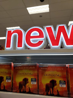
New makes way for a remodel and some Disney movies!
Help center: Scan, call, find! Target removed the red phone and store maps to make way for this.
One of the aisles in this store.
Office supplies, like the crayons pictured here, are found in this department (aisle C14)
What looks like to be bedding supplies in this section of the store...
...and another section!
The updated front end checkouts.
The bullseye makes it’s way for a remodel, and new checkout signs!
The checkout signs is an LED light integrated into the number.
Thanks for shopping at Target #2235, Post-Remodel!
Let’s walk a bit further down the road for the updated street sign!
And here it is!
Overall, I would rate this Target interior a 4, primarily because of the used of mixed-case signage (lowercase in grocery, uppercase in other departments)


Comments
Post a Comment